Redesigning Belgium’s most complete online legal library.
Strada lex
The challenge
Strada lex is a huge online legal platform with legal documents for lawyers, jurists, notaries, judges, etc. When we say huge, we mean huge: they harbor more than 2.5 million documents in their library. The site attracts about 100.000 active users each month and most claim to use it on a daily basis. Strada lex contacted us to update the platform, more specifically to improve the user experience and to modernize the user interface. Important to note is that there wasn’t any technical update or redesign of the database and recommendation engine. This provided an additional challenge to improve the platform within the means of the current infrastructure.
The approach
Firstly, we started out by exploring the online legal platform. We used a heuristics user experience evaluation based on the Nielsen Norman UX heuristics. This allowed us to detect the site’s weaknesses and strengths. Secondly, we put together a bilingual survey to get a better understanding of the current users, their frustrations and their desired improvements. Thirdly, we worked on the improvements in the form of design sprints. We divided the work into several sprints based on the knowledge gained through the survey to prioritize what had to be updated first. We also used those insights during the sprints to reflect on when designing the improvements. Lastly, we executed a big online user test to validate our improvements. Due to the coronavirus outbreak, we tested remotely and we decided to use the Maze user testing platform to gain insights. We learned a lot from that user test which allowed us to make some additional changes. Needless to say, the client was intensively involved in all parts of the process.
The solution
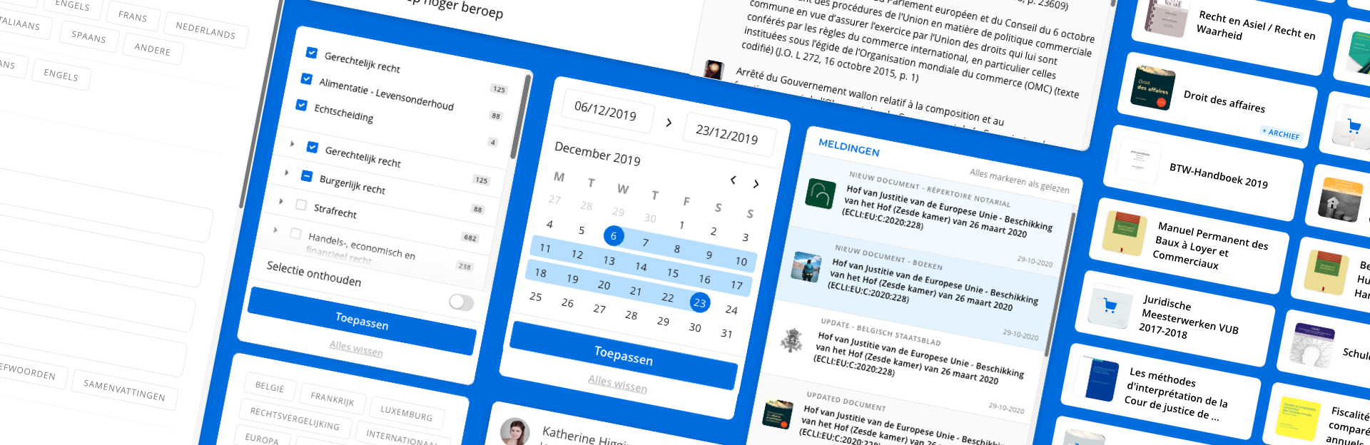
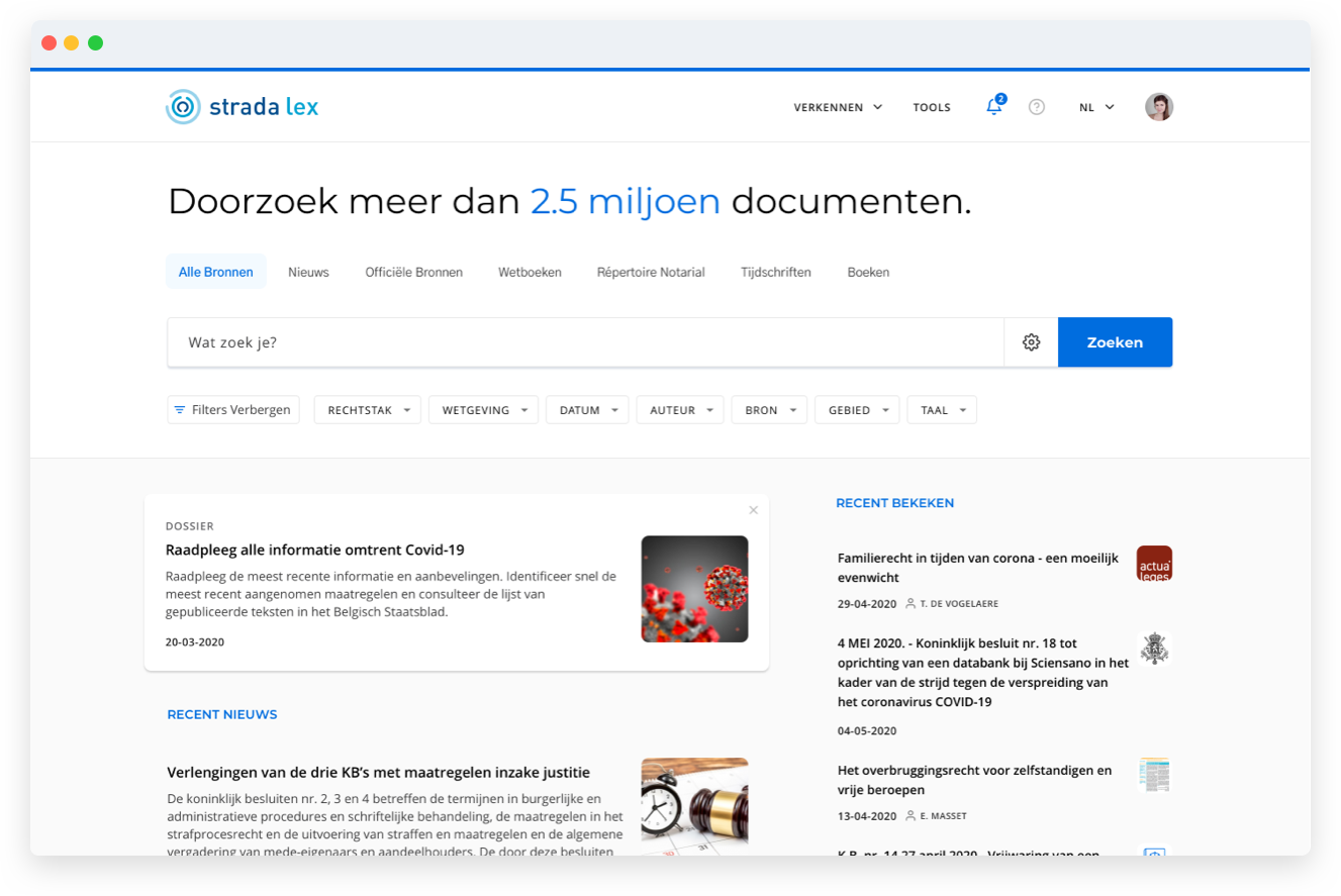
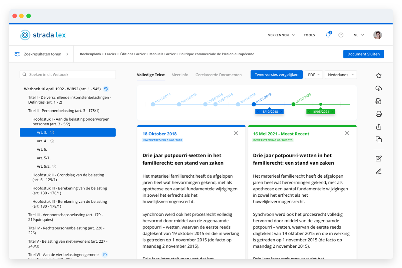
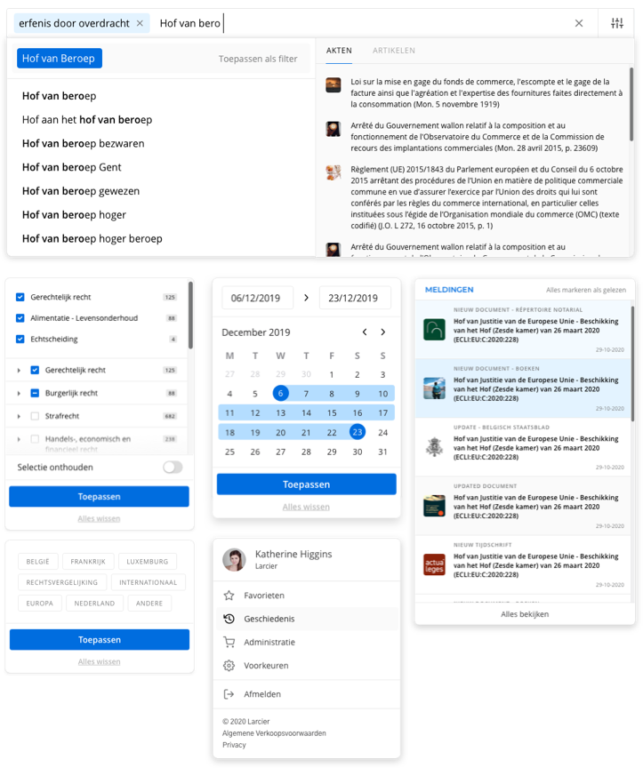
The end result was a brand new look and feel of the online legal platform with improved functionalities and flows to search. Users are easily able to find a document. Among many other improvements, we’re most proud of the way we’ve created a new navigation system on the platform that helps users understand the site’s structure and helps them easily locate a specific file. Furthermore, we’ve put the two most used filters directly on the front page for users to select immediately. It also helps the recommendation engine because it makes a more precise query which limits the number of results, which now gives a faster loading time. We also added a navigation tab to browse through different kinds of sources to discover new content. On top of that, we cleaned up the way the search results are presented by providing a better visual hierarchy amongst results to make it easier to scan them. We introduced action buttons directly to the result list as well. This allows users to take actions, like print or save for later, without leaving the results page. Lastly, we want to mention that we updated the appearance of the filter options so these are quicker to find and easier to use.

Any questions?
Tell me all about them.
Steven Poelmans
Manager Innovation Acceleration